Advanced Heatmaps
Understanding Advanced Heatmaps
Advanced Heatmap is specifically designed for Global Users on Tattle, who are typically brand-level executives and ownership groups. It’s a very powerful and interactive tool for leadership to get a high-level view of location performanes across operational categories, ordering channels, day parts and more. Brands have incorporated this feature in many of their daily internal operations, from identifying each location’s top opportunities in operations meetings, to tying GM bonus programs to the benchmarking and more.
1. Click on the “Stats & Analysis” tab in the menu bar to the left and select “Advanced Heatmaps”.
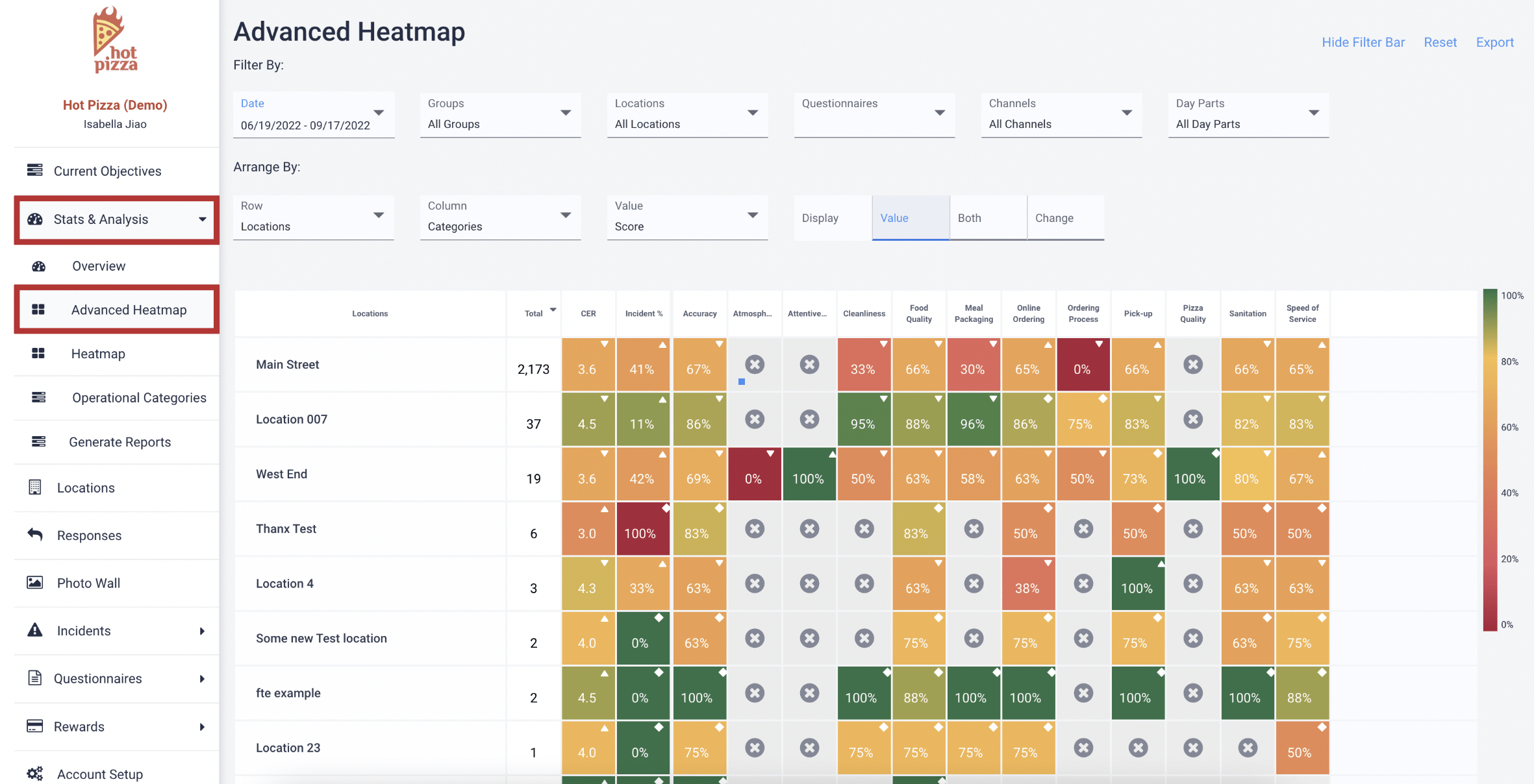
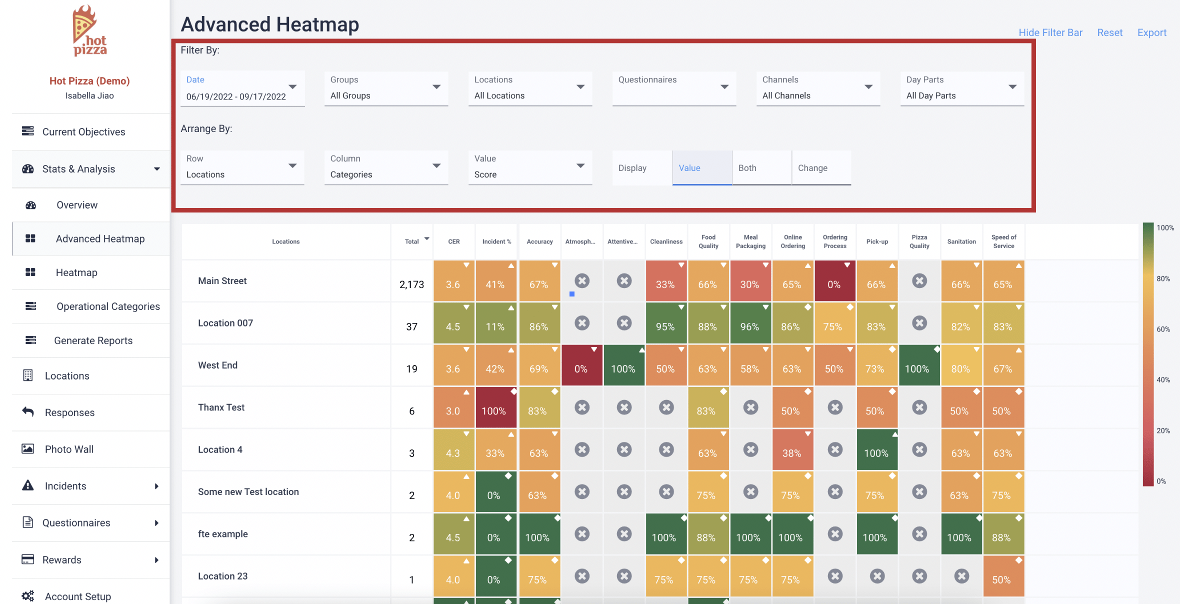
2. To filter and modify the view of this interactive heatmap, you can use the “Filter By:” and “Arrange By:” options at the top of the screen.
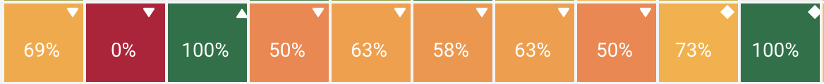
There are three symbols within any box on the Advanced Heatmap:
- Arrow Up: The metric has improved over the selected time period.
- Arrow Down: The metric has deteriorated over the selected time period.
- Diamond: The metric has remained the same over the selected time period.
You've completed 0 of 5 articles in this category