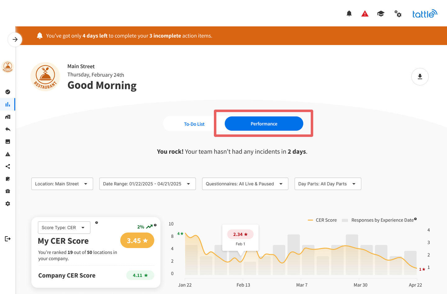
Performance Tab
Understanding the Performance Tab
The Performance tab is your analytics powerhouse, providing deep insights into your location's guest experience performance. This is where you'll discover trends, identify opportunities, and benchmark your success against other locations.
Overview
The Performance tab transforms your guest feedback into actionable intelligence. Through interactive charts, tables, and AI-powered rankings, you'll understand not just what's happening at your location—but why it's happening and what to do about it.
Available to: All single location users Default view: Last 90 days of data
Filters & Controls
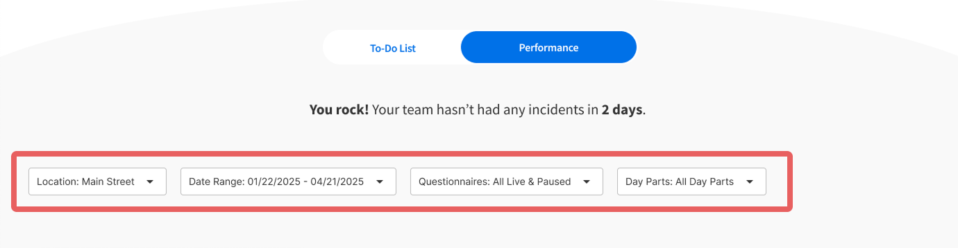
Location Filter
Available to: Users with access to multiple locations while viewing a single location dashboard
Select one location at a time to view its performance data. This is particularly useful for managers overseeing multiple units.
Date Range
Filter dashboard data by any date range you need:
-
Pre-set options: All Time, Yesterday, Last Week, Last Month, Last 90 Days, etc.
-
Custom range: Select specific start and end dates
Important: The experience date (when the guest visited) is used for all metrics, not the date the survey was submitted. This gives you more accurate insights into when issues actually occurred.
Questionnaires
Filter by specific questionnaires to focus on particular survey types. You can select multiple questionnaires at once.
Default state: All Live & Paused questionnaires
Day Parts
Filter by time of day based on your brand's custom day part configuration (set in Account Setup > Day Parts). This helps you identify if certain shifts or times of day are performing differently.
Note: All data below the filters updates dynamically based on your selections, except for the Operational Categories, Factors & Comments table.
Score Type Selector

Choose between three score types:
-
CER (Customer Experience Rating) - Overall guest satisfaction
-
Average Score - The average star rating across all Operational Categories
-
Top Box - Percentage of 5-star ratings
Pro tip: Your score type preference saves automatically on your device/browser for next time.
Benchmarking
Benchmarking displays your ranking based on the score type you've selected (CER, Average Score, or Top Box).
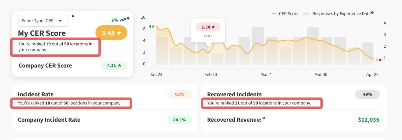
How it works: Benchmarking only includes locations with available data based on your current filters. For example, if only 11 out of 13 locations have survey data after filtering, it will display as "4 out of 11" rather than "4 out of 13."
Performance Graph
Your interactive performance graph displays trends over time, grouped by week. The graph includes:
-
Line - Your selected score type trend
-
Bars - Response volume by experience date
Key Metrics
Incident Rate
The percentage of surveys rated as incidents (1-3 stars). This metric includes a comparison to the industry incident rate across all Tattle partners, giving you context for your performance.
Recovered Incidents
Track how many incidents your team successfully resolved through guest recovery efforts. This demonstrates the power of responding to feedback.
Recovered Revenue
An estimate of revenue saved through incident recovery, calculated using:
-
The customer's next transaction amount (if available)
-
Your location's average check amount (if next transaction isn't available)
Day Parts Table
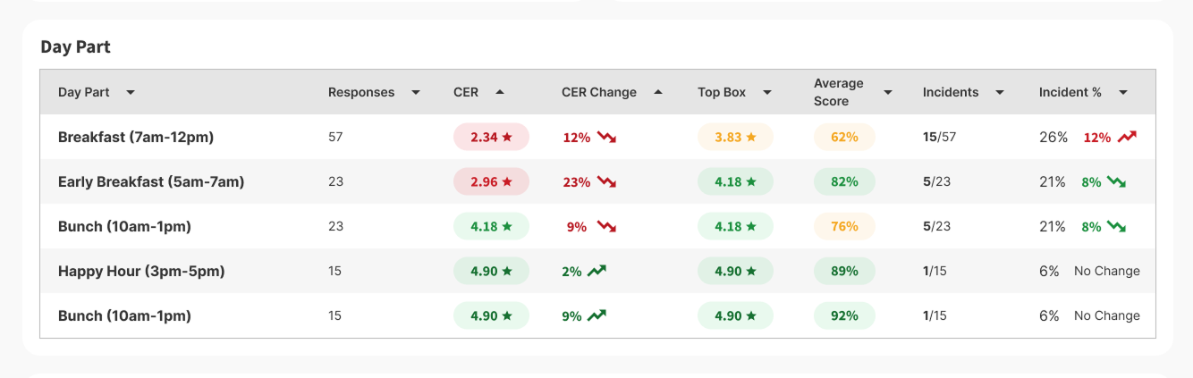
See how your location performs during different times of day or shifts. This table displays performance metrics broken down by your brand's custom day parts.
What's displayed: Dynamic based on filtering above Default state: Last 90 days of data
Use case: Identify if morning shifts consistently outperform evening shifts, or if lunch rushes are creating service challenges.
Channels Table
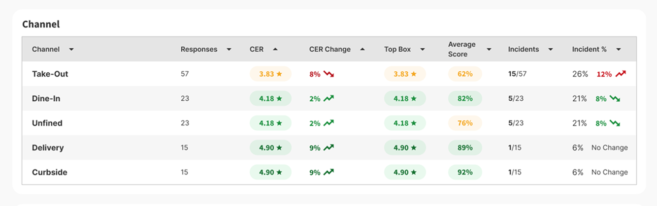
Understand performance across different survey channels (survey types). This helps you see if certain feedback collection methods are capturing different experiences.
What's displayed: Dynamic based on filtering above Default state: Last 90 days of data
Operational Categories, Factors & Comments
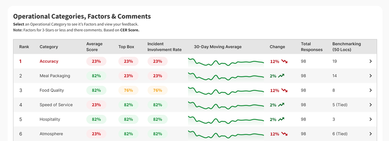
This is where Tattle's AI really shines. We analyze your guest feedback and rank Operational Categories by opportunity—showing you exactly where to focus your improvement efforts.
Understanding Opportunity Rank
How it's calculated: Tattle's AI examines:
-
How strongly each category's score correlates with your overall CER
-
How much room for improvement exists (identified by a low Top Box score)
What it means: The category with the highest opportunity rank is most likely to provide the greatest improvement to your CER if you focus on it.
Table Columns Explained
-
Operational Category - The area of your operation (e.g., Food Quality, Service Speed, Cleanliness)
-
30-Day Average - The change in score over the last 30 days
-
Change - The percentage change between the first and last day of the 30-day period
-
Incident Involvement Rate - How often guests rate this category 3 stars or less when the overall experience is also rated 3 stars or less
-
Responses - The number of responses received for each category
Exploring Factors & Comments
Everything on this table is clickable. Click any Operational Category to open a drawer showing:
-
Factors - Specific elements within that category (shown for 3-stars or less ratings)
-
Guest Comments - Actual feedback from guests, organized by factor
This drawer mimics the detailed information you'll find on the Operational Categories page today.
Export Your Data
Click the export icon to download a PDF export of your Performance tab. These exports are designed with guest experience in mind—comprehensive but not overwhelming.
Note: Export functionality is currently available on desktop only.
Tips for Using the Performance Tab
-
Start with Opportunity Rank - Focus your improvement efforts on the highest-ranked category
-
Compare time periods - Use date range filtering to see if recent changes are working
-
Dig into factors - Don't just look at category scores—click through to understand specific issues
-
Check day parts - Identify if certain shifts need additional training or support
-
Use benchmarking - Let healthy competition motivate your team to reach the next performance tier
-
Monitor incident recovery - Celebrate your team's efforts to turn negative experiences into positive ones
-
Review comments regularly - Quantitative data tells you what's happening; guest comments tell you why
You've completed 0 of 10 articles in this category