Insights & Updates
Latest from Tattle
Discover trends, tips, and insights to elevate your restaurant operations.
Discover trends, tips, and insights to elevate your restaurant operations.


Sometimes, just as important as collecting data, is a clear visualization of data.
Without the right graph, a lot of important information can be missed or hidden from plain sight. This brings us to one of Tattle partners’ favorites: the Bull’s Eye chart.
Before we dive in, let’s first look at this basic bar chart. It seems to clearly represent guest satisfaction across:
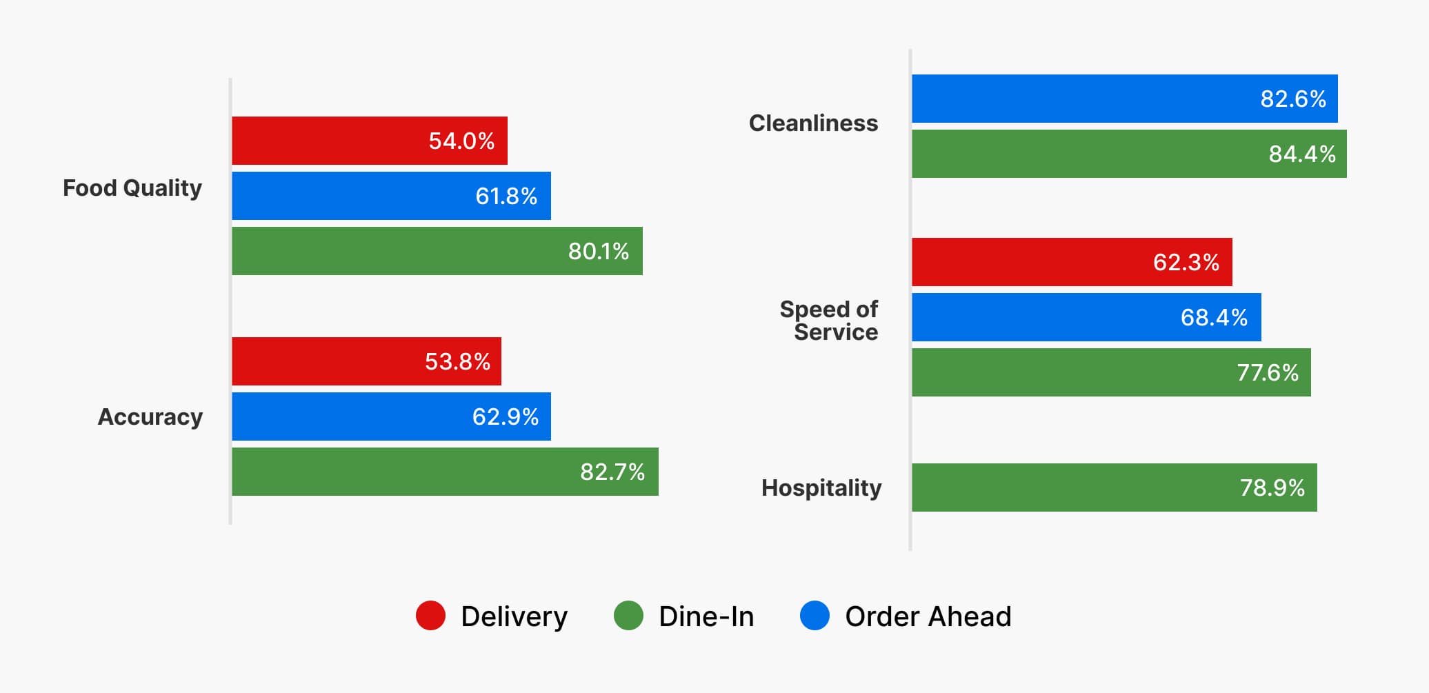
Most restaurant operators might just stop here. After all, doesn’t this chart lay out clearly the satisfaction level for, say, “order accuracy” across different channels, or say what are the best and worst performing operational categories in each channel?
What this chart misses, however, is actionability. Can you identify your biggest operational gap at one glance? And can you point out exactly how big the gaps are?
This is where the Bull’s Eye chart comes in.
First, let’s convert the bar chart into the following Bull’s Eye chart.
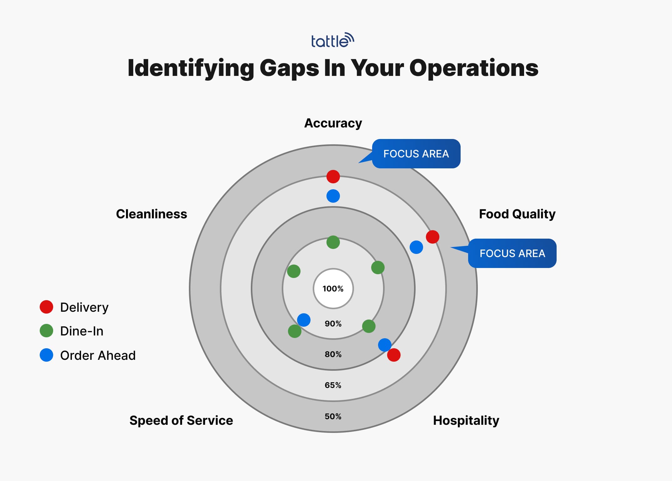
Now all you have to focus on is: are you hitting the bull’s eye?
Right off the bat, you can see that your green dots (dine-in satisfaction) are the closest to the bull’s eye (100% satisfaction) across all five operational categories. This shows you that dine-in experience overall is more positive than your off-premise channels. On the other hand, the blue dots and red dots are the farthest away from the bull’s eye, which means that order-ahead and delivery experience are overall less satisfactory.
Next, you might notice that the farthest out from the bull’s eye are the two red dots along “accuracy” and “food quality”. Red represents the delivery channel, and this clear visualization points you to your two biggest focus areas: “accuracy” and “food quality” in the delivery channel.
Just like that, your attention is immediately drawn to what you need to focus on the most — your biggest operational gaps.
Another benefit of using the Bull’s Eye chart is that it can incorporate way more data points than a bar chart without being overwhelming.
A bar chart with 20+ data points will look overwhelming and will be difficult to compare. However, with a Bull’s Eye diagram, you only need to focus on what’s the closest, and farthest, from the bull’s eye, and block out the other dots on the graph.
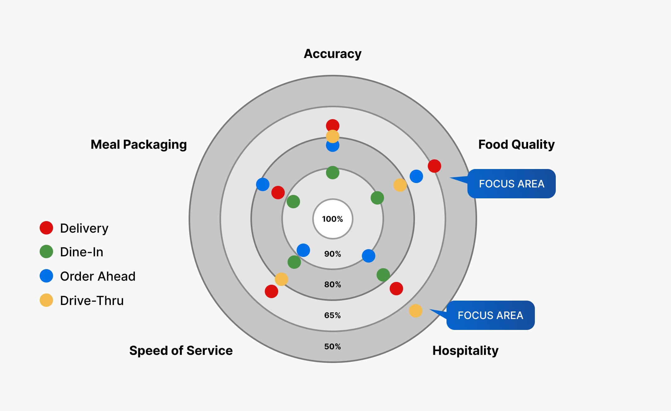
For example, in this chart with 5 operational categories and 5 ordering channels (the addition of red that represents drive-thru), there are a total of 19 dots. A bar chart with 19 bars would be incredibly confusing, whereas in a Bull’s Eye chart, you can immediately pinpoint the following as the biggest operational gaps:
With the operational gaps identified, you can then go on to investigate exactly what’s wrong with the identified operational category in each channel.
We have a variety of metrics and analyses that help you do exactly that level of in-depth investigation. You can find those articles in our blogs section on the website, and follow our LinkedIn to receive daily updates.
Want more?

About the Author
Intelligence & Analytics Expert
Alex formerly led Customer Excellence programs at Blaze Pizza and Dunkin'. Now, he oversees LTO testing, operational analysis, and ROI optimization for Tattle partners.